Thursday, 28 February 2013
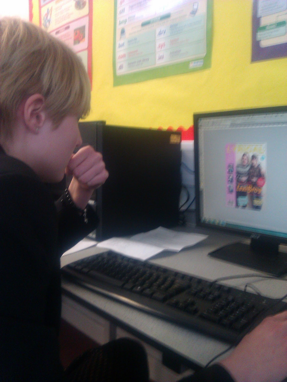
Working on PhotoShop

Updated Contents and Front Cover

This is the updated version of my front cover. I feel like I need to change the top line of the cover as it cannot be read from a distance and the colour isn't really appealing. I feel I need to use the stroke option on this aspect.

This is the updated version of the contents page. I feel that it is more effective, however as the front cover has now changed in its design I need to add the updated image of the cover onto my contents page to replace this last version.
Adjustments to my Magazine?
My music magazine is in the latter stages of production and the making process. I like my magazine and feel that all the different elements of the magazine target my audience and also I feel that they follow the house style and that you would know that they all belong together. However I know that the different bits of my magazine can still be improved to make them even more effective.

This is a print screen of the front cover of my magazine. There is a lot that can be improved to make it more effective. The constructive criticism that I have received from my teacher is that I need to:
- Make the "LeniBros feature bigger and further up on the front cover to make it be viewed in greater prominance as it is the main feature.
- Move the "Free Glowing Rubber" further up the page.
- Move the text boxes underneath of the main story.
- Make the text boxes bigger and also change the way that they are.
How will I attract my Audience?
In my music magazine pitch I said that I will try to target my audience through the use of "15 Greatest Poses/Dance Moves". These poses were in my original plan going to be performed by a a member of my target audience, but I didn't have a reason why I wanted this to be so.
These different poses were to be performed by someone that is representative of my audience and I have used this to make my audience wish to buy the magazine and also feel connected with the magazine through first seeing this on the left hand side of the magazine as it is clearly aimed at them.

I have also in my contents page included a bigger picture of the girl on the front and explained next to this in a caption that she is a contest winner and this meant that she was able to be on the front cover and on the contents page. This I also believe could inspire other members of the audience to want to apply for these contests to have their chance to be on the front cover of an actual magazine.

These different poses were to be performed by someone that is representative of my audience and I have used this to make my audience wish to buy the magazine and also feel connected with the magazine through first seeing this on the left hand side of the magazine as it is clearly aimed at them.

I have also in my contents page included a bigger picture of the girl on the front and explained next to this in a caption that she is a contest winner and this meant that she was able to be on the front cover and on the contents page. This I also believe could inspire other members of the audience to want to apply for these contests to have their chance to be on the front cover of an actual magazine.

This is, I also believe, a way in which my magazine is different from others as it feels inclusive to them as they are getting opportunities to become on of those people.
Wednesday, 27 February 2013
DPS - Improvements
I have been improving my double page spread too both from criticism from my teacher and myself.


This is a print screen of all the improvements I have made on my DPS. I have added some random facts over the the pictures of both Roan and Austen and I have also quoted Roan's joke about the snow over the pictures of both of them. This was to make sure that the double page spread didn't look boring and also to keep my target audience interested on the page.
I also feel that I should change the colour of of the page numbers to keep consistent with the housestyle I created on the contents page.
Contents Page - More Improvements

I also have recieved feedback on my contents page from various different sources such as my teacher and my parents who told me that with a few teaks to my contents page it can become more effective. I was told to create more space under the headings of each of the sections of the contents page and I was also told that I could align all of the different lists of contents with the headings too.

In this printscreen. In this I am aligning all my contents pages and the text boxes together to make sure that they are in a straight line, I am using the grid option on photo shop to help me to do this. This was an idea raised by my teacher.

This is my contents page with everything adjusted on it.
Using Stroke
As I want my front page to stand out I have been using the stroke tool on most of the words on the front cover to make sure that the front can be read and stand out.
Before:


After:

I have learnt from this that the stroke option is good to use especially on the front cover of my magazine to make things stand out to my audience and also make it even more readable through adding contrast to their background. This especially applies to the yellow colouring of my name.
Before:

Using Stroke:

After:

I have learnt from this that the stroke option is good to use especially on the front cover of my magazine to make things stand out to my audience and also make it even more readable through adding contrast to their background. This especially applies to the yellow colouring of my name.
Subscribe to:
Posts (Atom)